More Color

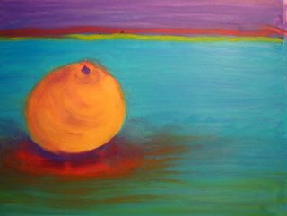
Last night I experimented with using any old content but pushing the color as far as I could. I like the result although I realize I still stuck with fairly realistic colors. Maybe next is a series of totally unrealistic oranges? I can't remark enough about the quality of the Sennelier oil pastels, and to think these have sat on a shelf in my studio for years. I think my French cousin gave them to me for Christmas one year. Bless that man!
I liked playing with the line at the horizon/table edge. Is it too distracting to have red and yellow there or does it add to the overall composition? I'd like to hear your comments.
I pasted a link to Eric Aho's work in a reply to Lady Di, but here it is for anyone else who would like to see. You can see his color is certainly nothing that is inspiring me, but his landscape forms. http://www.artnet.com/artist/1306/eric-aho.html


<< Home