Saturday, November 16, 2013
Pastels
Lately I've revisited soft pastels, they can range from chalk-like to smoothly milled, almost like powder in a stick. Unlike oil pastels they don't glide on the paper so you need a paper with some tooth, a texture. You can buy sanded paper (which is what I've used here) or make your own textures by adding sand to gesso or buying special textured gesso to prepare the paper.
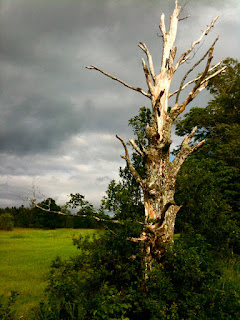
Another look at local area, Spruce Creek:
Saturday, May 12, 2012
Motorcycle Mama
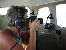
Daytona Beach is famous for its races, but also for Bike Week, the last week in February, when 1000's of motorcyclists from all over the country (the world?) arrive en mass for the "gathering of the tribe". Each year I swear I have to document this invasion somehow, as my little hometown south of Daytona becomes a destination for the bikers and the "wall of sound" invasion is constant. One day this past Bike Week I took my Canon Rebel Xs and stood on the corner of US-1 at a traffic light, and shot for about a 1/2 hour. I got some great characters and was so happy with the shots I decided a new painting series was born. This 14x14" canvas I call motorcycle mama. She's based on a real person, but of course I had to add my own artistic flair.
Monday, March 19, 2012
Three, Four, Five Palms
This little 8x8" painting began as 3 palms and I found they aligned themselves in the way we humans almost always manage to do: perfectly evenly spaced. No, no! Nature doesn't do symmetrical, mostly placement is random, or asymmetrical, since birds dropping seeds, hurricanes, and high tides rule sowing of palm trees where human hands aren't involved. OK, I know, snowflakes are symmetrical, I love the famous VT photographer, Snowflake Bentley's gorgeous snowflake shots, too, but for palm trees... asymmetrical is best. Sooooo, I admit it, this one is Photoshopped. I selected the far right tree with my lasso tool, copied it, transformed it by tilting and stretching a bit, erased anything that didn't look right and voila! a better composition. Then I did it again with the far left tree, 5, even better, an uneven number. I love editing my paintings this way. I can do it in Photoshop and then fix the painting with paint if I like the results! Talk about a time-saver and less stress for the artist!
More Beach People
I've been lax about posting to this art blog, teaching, gardening, yes, and even painting. Here are a few of my most recent paintings in the beach people series I began a year ago. I'm working on staying loose with my brush strokes but I find those darn hard edges cropping up throughout my work...."lost edges", Lisa, lose them! The Reader, was painted a few months ago and I think I captured the softness of hazy beach sun I was looking for (and calm beach reading).
Sunday, September 19, 2010
A New Series
I'm pretty excited. I painted for the past 3 days in a workshop with Jane Slivka and rather than do the exercises she had her other students doing I just worked on the figure, my personal goal for the class. I'm very happy with the results and plan to explore the figure further in this same style. I'm calling it my beach people series. What do you think?
Saturday, August 14, 2010
Photography Class


 I've been SO busy teaching this year I've not been painting much. Right now I'm teaching Environmental Photography for Green Mountain College in Poultney, VT (online of course).
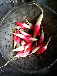
I've been taking a lot of photos this summer, plus spent a month, June/July, teaching Tech 4 Educators 2x face-to-face in southern VT. These are VT pix: walks, Farmer's Markets, all would make great painting subjects. I take a lot of photos with my artist's point of view. It's a different medium than painting, pure composition with light and color, without all the painting technique issues; good for keeping my "art eye" fresh.
Labels: summer photos
Saturday, January 30, 2010
January Art Workshop w/ Jane Slivka

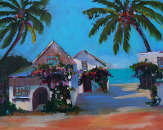
This is the second year I've painted with Jane. She has a nice loose style and a Florida palette both of which I appreciate. This is probably my favorite for the 3 days. It is done from a photo I took of a house here in New Smyrna Beach. I added the water in the background, which isn't really visible, but adds some depth to the painting.


